



















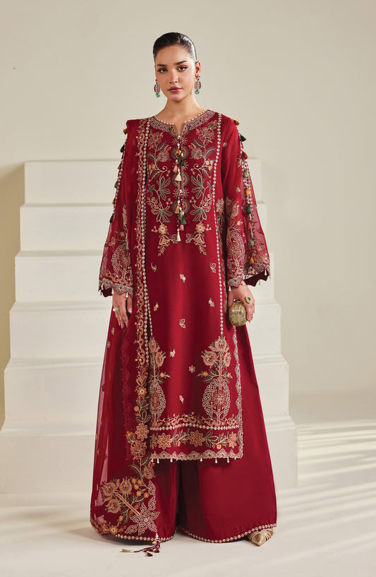

Bridal Sister Outfit Coordination: Matching Without Matching Exactly
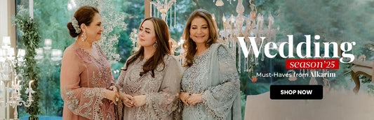
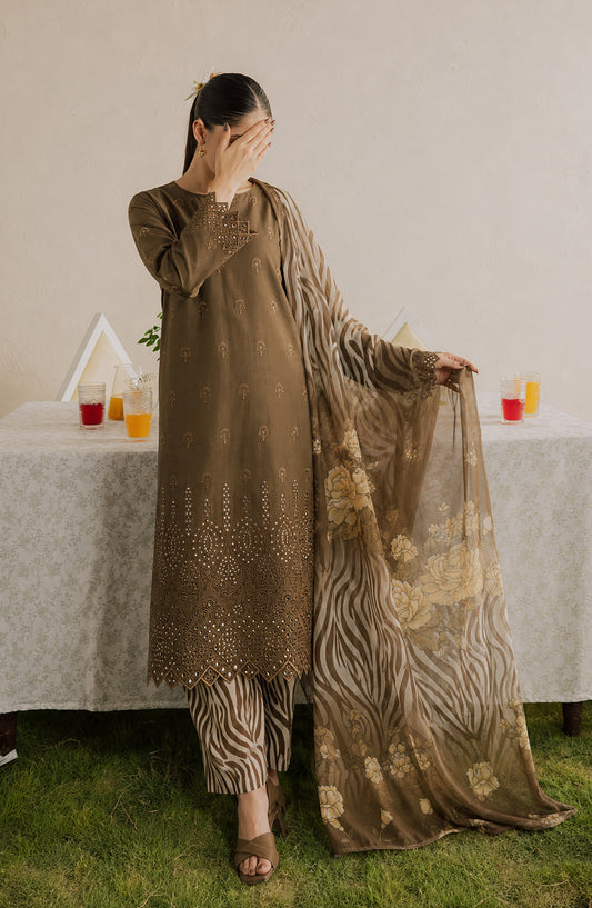
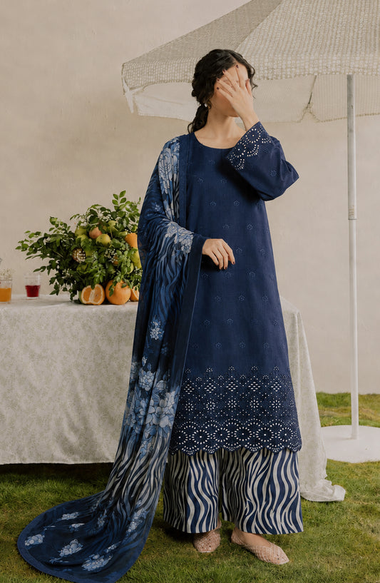
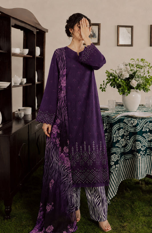
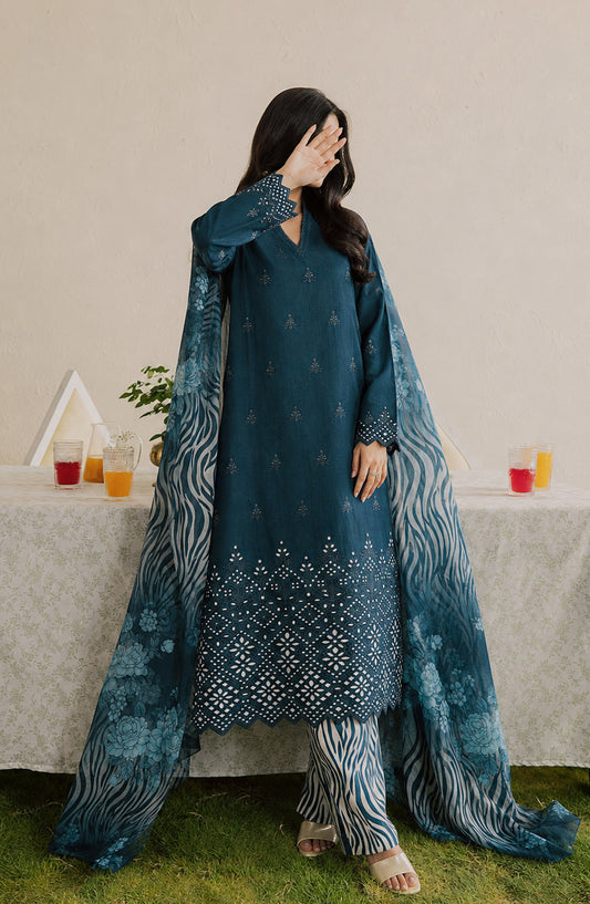
The best sister and bridal squad coordination reads as intentional, not identical — a shared color story, complementary fabric textures, and enough individual variation in cut and embellishment that each person still looks like themselves. Exact matching, while visually striking in a single photo, tends to flatten individual style and can feel more like a uniform than a considered group look across an entire wedding season. Here's how to build coordination that photographs beautifully without erasing everyone's individual style, using pieces from Wedding Formals.
Coordinated Color Palettes That Actually Photograph Well
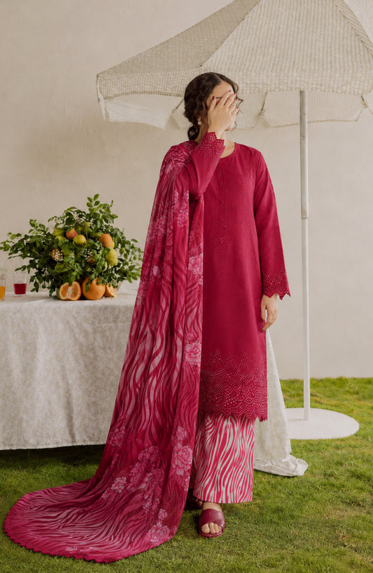
Tonal Coordination: Choosing multiple shades within the same color family — different depths of pink, for instance, from blush to rose to deep magenta — creates cohesion in photographs while allowing each person to wear a shade that suits their own skin tone and personal preference.
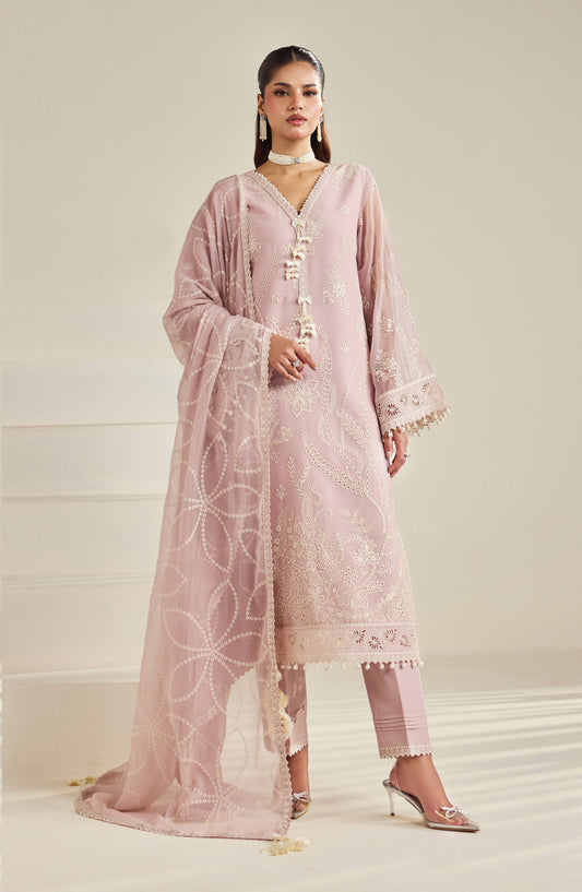
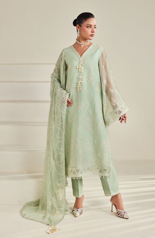
Complementary Color Pairing: Rather than one single color, coordinating around two or three colors that work well together (like dusty rose, sage green, and cream) gives more individual choice while still reading as a considered, unified group in photos.
Accent Coordination: An alternative to full-outfit color matching — everyone wears their own choice of color, but coordinates through a single shared element, like matching or complementary dupattas, similar jewelry tones, or a shared embellishment style (all gold-toned, for example, regardless of the base outfit color).
Avoiding the Flat, Identical Effect: Full identical-color coordination (everyone in the exact same shade) can work for a single formal photo moment, but tends to look repetitive and less dynamic across a full event's worth of candid photography — variation within a shared palette generally photographs better over time.
Mixing Fabrics and Textures Within One Cohesive Theme
Coordination doesn't require everyone to wear the same fabric — in fact, mixing textures within a shared color story often creates a more visually interesting, less costume-like result.
Texture Contrast Within Color Unity: One sister in a structured organza suit, another in flowing chiffon, and another in a subtly embellished net piece — all within the same color family — creates visual depth in group photos rather than a flat, uniform texture.
Matching Embellishment Style, Varying Density: Coordinating around a shared embellishment technique (all featuring similar embroidery style or all incorporating tilla work, for instance) while allowing each person's outfit to carry a different density of that embellishment keeps the group cohesive without requiring identical pieces.
Varying Silhouettes, Shared Palette: Different body types and personal style preferences mean different silhouettes will suit different people — a shared color and general formality level allows one sister to wear a lehenga, another a gown, and another a structured suit, all reading as coordinated through color rather than cut.
Steering Clear of the "Uniform" Effect
A few specific choices are what tend to push coordination into looking like a matching costume rather than an intentional group aesthetic:
-
Identical necklines and sleeve styles across every outfit — even in the same color, identical cuts across multiple people can read as overly uniform; varying the neckline or sleeve style while keeping the color consistent avoids this.
-
The exact same embellishment pattern repeated on every outfit — a shared embellishment technique is fine, but the exact same motif or pattern appearing identically on multiple people can feel less like coordination and more like a costume set.
-
Matching down to accessories and hairstyle — coordinating outfits is generally more effective than trying to coordinate every single element (jewelry, hairstyle, makeup) identically, which can start to feel overly staged rather than naturally cohesive.
-
Ignoring individual body types in favor of identical silhouettes — a cut that flatters one person's frame may not suit another's; prioritizing color and formality coordination over identical cuts respects individual fit needs while still achieving a unified look.
Coordination Ideas by Wedding Event
Mehndi: Bright, festive tonal coordination works particularly well here — a group in varying shades of yellow, orange, and coral, for instance, reads as cohesive and celebratory without needing identical outfits. Mixing in floral jewelry as a shared accent element ties the group together further.
Nikkah: A softer, pastel-toned coordination — everyone in muted tones within the same family (dusty rose, sage, powder blue) — suits Nikkah's more understated formality, with variation in silhouette and embellishment density keeping individual style intact.
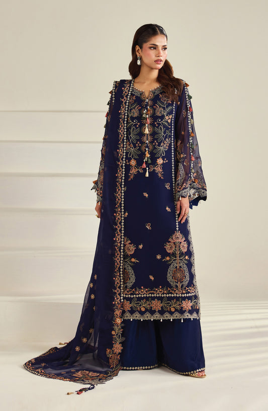
Barat: This is often where families lean toward a more unified, richer jewel-toned coordination given the event's higher formality and photography focus — though even here, varying fabric texture (velvet alongside raw silk, for instance) within a shared color keeps the group from looking overly matched.
Valima: Given Valima's more contemporary styling flexibility, coordination here often works well through a shared accent (all incorporating a similar metallic tone, for instance) rather than full-outfit color matching, allowing for more individual silhouette choices in an evening-reception setting.
FAQs
1. Should bridal sisters wear the exact same outfit color?
Not necessarily — tonal coordination (different shades within the same color family) or complementary color pairing generally photographs better and allows more individual choice than identical, single-shade matching.
2. How can I coordinate outfits with sisters who have different body types?
Focus coordination on color and formality level rather than identical cuts, allowing each person to choose a silhouette that suits their own frame while staying within the shared color story.
3. Is it okay to mix different fabrics within a coordinated group look?
Yes, mixing fabrics like organza, chiffon, and net within the same color family often creates more visual interest and depth in photos than everyone wearing identical fabric.
4. What's the easiest way to coordinate without buying matching outfits?
Coordinating through a single shared accent element — like similar dupatta tones, matching jewelry style, or a shared embellishment technique — is one of the simplest ways to achieve cohesion without full outfit matching.
5. Does sister coordination need to be the same across every wedding event?
No, coordination can shift event to event — brighter tonal coordination for Mehndi, softer pastels for Nikkah, richer jewel tones for Barat, and more flexible accent-based coordination for Valima all work well within their respective event contexts.